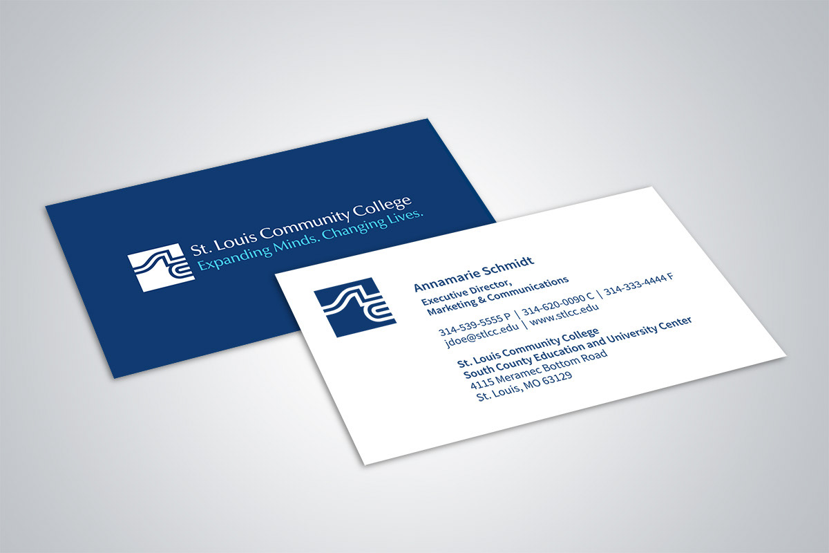
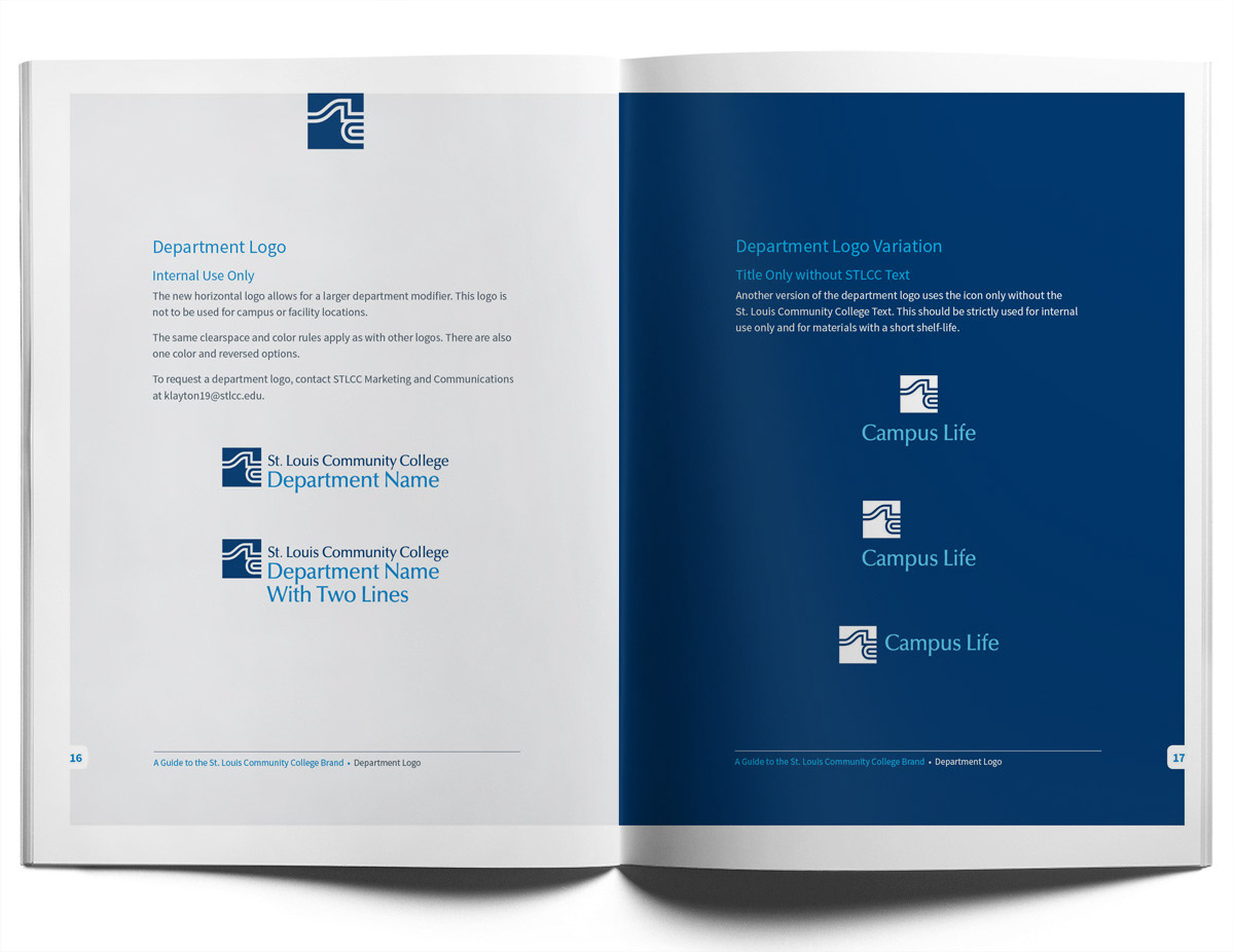
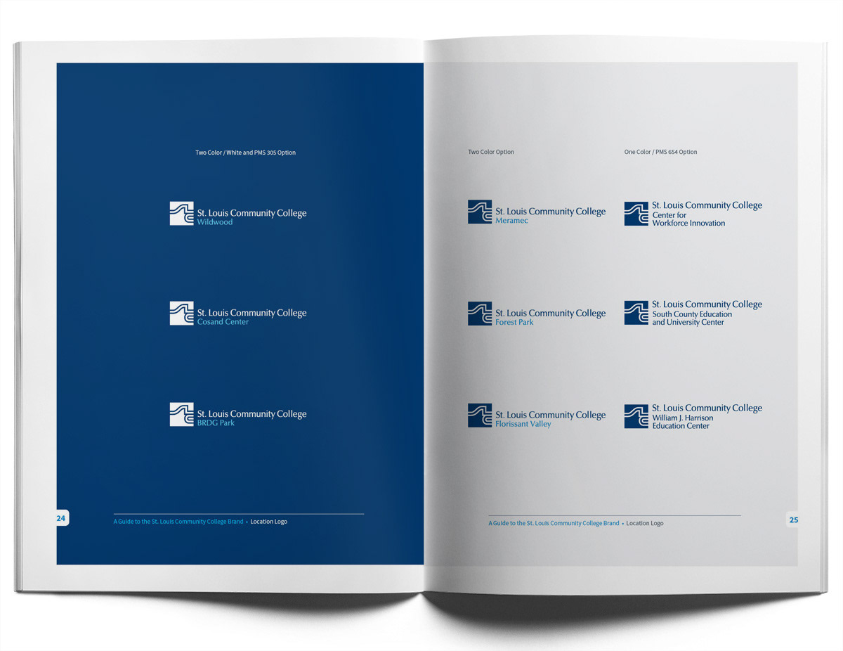
St. Louis Community College has an icon with a lot of associated equity. With budget constraints and a multitude of design projects in the pipeline, I took the existing icon and typography and re-engineered them. The result was a new horizontal version of the logo and a more adaptable footprint that could be used for mobile and print. With the new version of the logo, I also created a graphic standard document that outlined a new direction for the visual components of the STLCC brand. This included a revised color palette, a standard san serif typeface, and best practices for design.